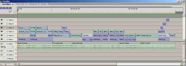
SCREEN GRABS FOR SQUARES a
continued:
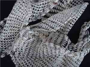
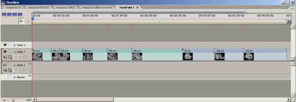
f. Tuck-FoldStill
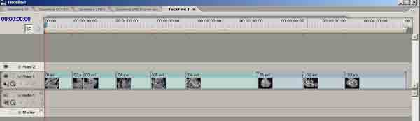
g. Tuck-fold-TimeLine
posted by jnabney at 6:26 AM
1 comments
![]()
posted by jnabney at 6:26 AM
1 comments
![]()
posted by jnabney at 6:24 AM
0 comments
![]()
posted by jnabney at 6:23 AM
0 comments
![]()
posted by jnabney at 6:20 AM
0 comments
![]()
posted by jnabney at 6:17 AM
0 comments
![]()
posted by jnabney at 6:07 AM
0 comments
![]()
posted by jnabney at 4:10 PM
0 comments
![]()
posted by jnabney at 3:51 PM
0 comments
![]()
posted by jnabney at 12:34 PM
0 comments
![]()
posted by jnabney at 12:23 PM
0 comments
![]()

posted by jnabney at 3:43 AM
0 comments
![]()
posted by jnabney at 3:41 AM
0 comments
![]()
posted by jnabney at 2:50 AM
0 comments
![]()
posted by jnabney at 3:33 AM
0 comments
![]()
posted by jnabney at 3:25 AM
0 comments
![]()
posted by jnabney at 3:17 AM
0 comments
![]()
posted by jnabney at 12:29 PM
0 comments
![]()
posted by jnabney at 5:18 AM
0 comments
![]()
